
Our home colors -Updated- + Why I love to design with color?
I was thinking a lot about this question this week. Why I love designing with color, why I like color on my walls? And I just realized it all comes back to my childhood, where I grew up and where I was born.
I was born in Peru and I was always surrounded by color everywhere, on the streets the buildings were always colorful, if you went to downtown or city centre the colonial houses surrounding the main square were all full of colors, from red, to blue to mustard, a beautiful display of color combinations. And I used to walked those streets almost everyday on my university days. There were colorful and eclectic posters on almost every street wall, it was almost like our kind of street art. The food, always colorful and complex. Again, colors everywhere I went.
My home growing up and my grandparents home that I used to go to almost daily after school also had colors on the walls. White was only a color choice for the ceilings but the walls were always painted with a pretty color like clay, pale yellow, soft blues. Walls in my home were also dressed with colorful art, art with colorful flowers. My mom has the most beautiful art collection on her walls, she used to bring a new piece of art home almost weekly and I remember going with her to the art gallery and then picking up the design for custom framing. I have two of art pieces from her collection in our home that she brought to us as a surprise on one of her visits, they are my favorite and most treasured pieces of art in our home. You can see them in one of the pictures bellow.
I want to take pictures of my home growing up on my next trip to Peru to show you!
Since this last post I shared about our home colors I made a few additions to our home color palette so I thought it was time for a little update post.
Let’s start from the most recent, my dear kitchen island we just finished. I painted it this gorgeous burgundy called Preference red by Farrow and Ball. Its such a good looking red, it just makes me so happy when I look at it and I love how it looks with our green cabinets, the color is Sage green light by Sherwin Williams. I will get into more detail about our cabinets in another post.
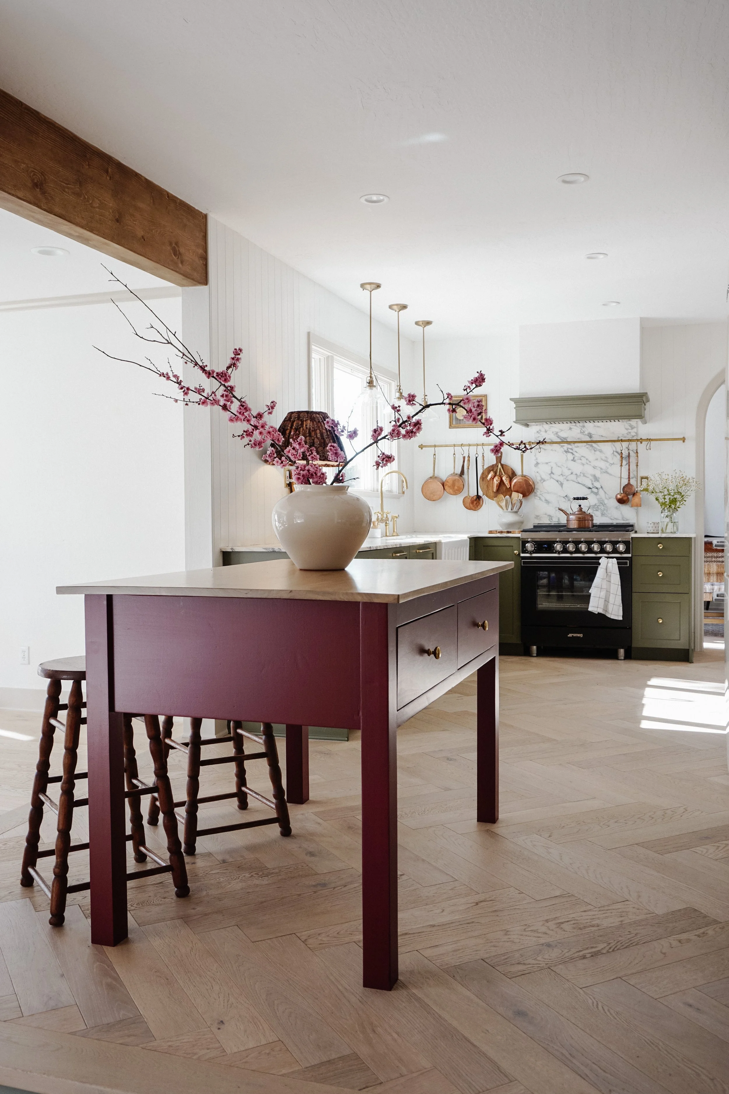
Island color is Preference red by Farrow and Ball

Green cabinets are Sage green light by Sherwin Williams
The next addition that happened before our kitchen renovation last year is our pantry. I adore the mustard/yellow gold color in there with the fruit wallpaper by Morris & Co. Its a perfect match if I say so. One of the best things about having a pretty pantry is that you want to keep it organized and pretty looking, that is a win! haha. The color I used is called Good as gold by Clare.

Pantry color is Good as gold by Clare
Another change I made last year was to paint the trim in the dining room and living room a contrasting color. We have white walls there and I felt it needed a little something so I went with Accessible Beige by Sherwin Williams and I love how it turned out. Makes the perfect backdrop for all our furniture.

Walls are Pure white by Sherwin Williams and trim Accessible beige

Last but not least and this one is getting a bit controversial on my Dm’s. Why? Well…
I painted our family room walls twice already (three times if white paint counts haha) and I am now considering painting it a third time… I know, I know. But that’s me, I get these ideas that I can’t get out of my head and usually when I listen to my instinct about something it is just right. But, with this Family room I don’t know, it’s been the hardest to figure out for some reason. We all have at least one room like that, right?
The current color is called Evergreen fog and don’t get me wrong, the color is actually pretty perfect! it is a gorgeous green/gray, soothing and looks beautiful paired with warm tones like brown, rust, mustard and gold. I love the color! but I don’t feel like it is the right color for the space. So I might -most certainly- change it -very soon-.

Evergreen fog walls.

One of the changes I made since I shared this post about our home colors is that I went back to white on the stairs but the other rooms remain the same.
Here is how our home color palette looks at the moment and I could’t love it more! Stay tune for the new color I might - will- use on the family room.

Our home colors. From left to right, starting from the top row.
1. Laundry room custom color, color code found here.
2. Principal bedroom color, Urbane bronze by Sherwin Williams.
3. Kid’s bathroom, Gray Heron by PPG.
4. Stairs and black accents. Tricorn Black by Sherwin Williams.
5. Guest Bedroom, Canyon Clay by Sherwin Williams.
6. Ellie’s room, Custom yellow color, color code found here.
7. Kitchen cabinet color, Sage green light by Sherwin Williams
8. Current Family room color, Evergreen fog by Sherwin Williams.
9. Kitchen island color, Preference red by Farrow and Ball.
10. Pantry color, Good as gold by Clare.
11. Downstairs trim color (baseboards and crown molding), Accessible beige by Sherwin Williams.
12. Boy’s room bunk bed, Deep dive by Clare.
13. Boy’s room closet, Good jeans by Clare.
Love,
Valeria